
The Flutter SDK allows you to build Android, iOS, web, and desktop apps from a single codebase. This is done using platform-specific features as well as media queries, and it enables developers to ship applications faster. Flutter also offers close- to-instant feedback with the hot reload feature, enabling you to iterate quickly on your application.
In this piece, we’ll cover the fundamental concepts you need in order to start working with Flutter.
Core Technologies
Flutter’s core technologies are Dart— a programming language developed by Google—and Skia — a 2D graphics rendering library. The language has been optimized for building user interfaces. This makes it a good fit for the Flutter framework. The language is fairly easy to pick up, especially if you have a background in JavaScript and object-oriented programming generally.
You can head over to DartPad to try it out:
While you’re there, you can also create a Flutter project and see your application in real-time.
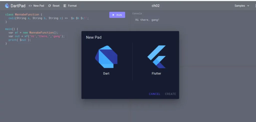
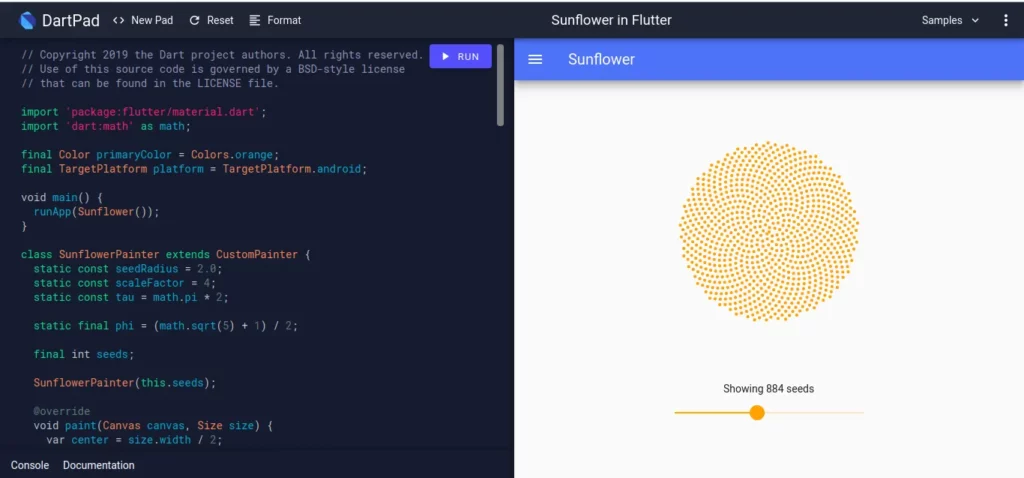
DartPad makes it really easy to try out Dart and Flutter. Here’s an example of a sample application you can run on DartPad.
Flutter Building Blocks
In Flutter, you define your user interface using widgets. In fact, everything in Flutter is a widget. Your application itself is a widget made up of several sub-widgets. All the widgets form what is known as a widget tree.
Widgets are used for — but not limited to:
- Creating rows
- Creating columns
- Styling elements
The beauty of Flutter is that most of the widgets you’ll ever need have already been built for you. Therefore, you most likely won’t need to write them from scratch.
Core Widgets
As you’ve seen from the widget catalog, Flutter has so many widgets. It wouldn’t be possible to cover all of them in one article. That notwithstanding, let’s highlight a few that you’re most likely to use in all projects.
MaterialApp
This is used to define an application that uses material design. Using MaterialApp enables you to:
- Define the primary color used in the entire application
- Define the accent color used in the entire application
- Define your application theme details, such as text style, text color, fonts, etc.
MaterialApp(
          title: 'Your Title',

          theme: ThemeData(
            primarySwatch: Colors.lightBlue,
            accentColor: Colors.teal,
            fontFamily: 'Lato',
            textTheme: ThemeData.light().textTheme.copyWith(
                  title: TextStyle(
                    fontSize: 20,
                    fontFamily: 'Lato',
                    fontWeight: FontWeight.bold,
                  ),
                ),
          ),
          )
The declared theme styles can be used in other parts of your application, as shown below:
Another crucial functionality MaterialApp provides is route implementation. You can define the route names in your screens and declare them in your main Dart file. They’re defined as shown below and are referred to as the routes table.
The / route defines the home of your application. When declared, the Home property shouldn’t be defined on MaterialApp. You’re also able to define the route to navigate to in case of an unknown route using onUnknownRoute.
routes: {
            '/': (ctx) =>  TabsScreen(),
            ScreenOne.routeName: (ctx) => ScreenOne(),
            ScreenTwo.routeName: (ctx) => ScreenTwo(),
            ScreenThree.routeName: (ctx) => ScreenThree(),

          },onUnknownRoute: (settings) {
        return MaterialPageRoute(builder: (ctx) => HomeScreen(),);
      }
Defining the route in your screens’ Dart files is done by creating a static constant:
static const routeName = ‘/your_route_name’;
Scaffold
Scaffold enables you to implement the basic visual layout of your apps. It makes it seamless for you to add an appBar, a snackbar, and a bottom navigation — just to mention a few.
Note that you can use your theme to define the background of your appBar. body is used to define the widget tree that will form the body of the screen.
return Scaffold(
    appBar: AppBar(
      title: const Text('Some Text'),
       backgroundColor: Theme.of(context).accentColor,
      body: YourBodyWidget(),
    )
  );
GestureDetector
This is an invisible widget that enables you to react to user gestures, such as taps, drags, double-tap, long press, and vertical drag, just to mention a few.
GestureDetector(
  onTap: () => runYourFunction()
  child: Container(
        padding: const EdgeInsets.all(15),
        child: Text(
          "Your Text",
          style: Theme.of(context).textTheme.title,
        ),
        decoration: BoxDecoration(
          boxShadow: const [
            BoxShadow(color: Colors.teal),
          ],
          borderRadius: BorderRadius.circular(15),
        ),
      ),
);
Container
As seen in the example above, a Container has been used to wrap the text. A Container is quite handy when you’d like to declare attributes such as padding and decoration.
If you’re only interested in defining padding, you should use the padding widget instead. In this case, a BoxDecoration has been defined, enabling us to set the color of the shadow as well as the border-radius.
CircularProgressIndicator
As the name suggests, this widget is used to define a loading indicator. It can come in quite handy, especially when fetching data from a server.
RefreshIndicator
This widget is useful when you want to implement a pull-to-refresh feature on a certain screen.
GridView
GridView is used to define an array of scrollable widgets.
Here are the arguments that it takes:
- itemCount that defines the total number of items the builder should expect
- itemBuilder that builds the widgets on demand
- SliverGridDelegateWithFixedCrossAxisCount that creates a grid layout that has a fixed number of tiles. The alternative — SliverGridDelegateWithMaxCrossAxisExtent — creates grid layouts that will equally share the available space
- CrossAxisCount that defines the number of children in the axis.
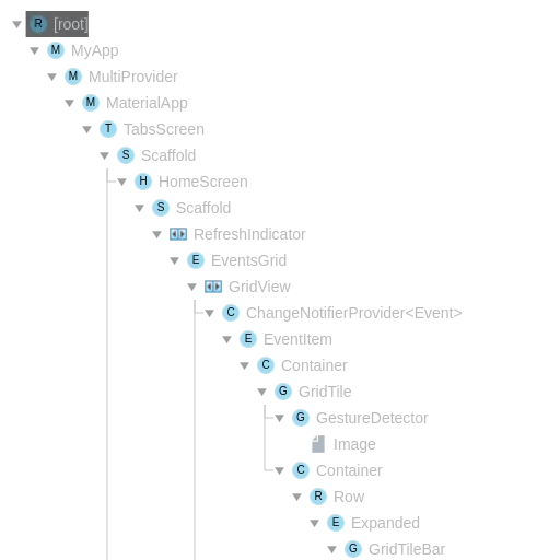
More on the ChangeNotifierProvider used in this snippet later.
 return GridView.builder(
      padding: const EdgeInsets.all(10.0),
      itemCount: events.length,
      itemBuilder: (ctx, i) => ChangeNotifierProvider.value(
        value: events[i],
        child: EventItem(),

      ),

      gridDelegate: SliverGridDelegateWithFixedCrossAxisCount(
        crossAxisCount: 1,
        childAspectRatio: 3 / 2,
        crossAxisSpacing: 10,
        mainAxisSpacing: 10,
      ),
    );
events, in this case, is a list of events. Using GridView.builder() is usually recommended when you don’t know the number of items to expect—for example, when you’re pulling data from a server. In a live app, this is critical in performance optimization because the list items will only be displayed when they come into view.
ListView
The ListView widget is used when you want to create a scrollable list of items. It also provides a builder class in the event of an infinite list or a very long list.
 return ListView.builder(
      itemCount: events.length,
      itemBuilder: (ctx, index){
      return card()
      }
    );
Row and Column
A Row displays its contents in a horizontal manner, whereas a Column displays its contents in a vertical manner. These widgets don’t allow for scrolling. If you need to scroll, use other widgets such as ListView and GridView.
Row(
crossAxisAlignment: CrossAxisAlignment.start,
children: <Widget>[
Text('Your Text'),
],
),
Column(
crossAxisAlignment: CrossAxisAlignment.start,
children: <Widget>[
Text('Your Text'),
],
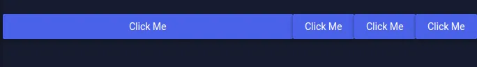
),CrossAxisAlignment defines the placement of items in the axis. This is an enum with the following options: baseline, center, end, start and stretch. Let’s see how these would look on DartPad:
CrossAxisAlignment.center
CrossAxisAlignment.end
CrossAxisAlignment.start
CrossAxisAlignment.stretch

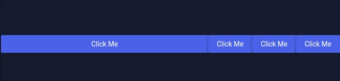
You can also define the MainAxisAlignment. This will dictate how the children should be placed along the main axis.
MainAxisAlignment.center
MainAxisAlignment.end
MainAxisAlignment.spaceAround
MainAxisAlignment.spaceBetween
MainAxisAlignment.spaceEvenly
MainAxisAlignment.start
Expanded
This widget will expand a Flex, Column, or Row widget to occupy all the available space. Let’s see this in action using a Column and a Row.
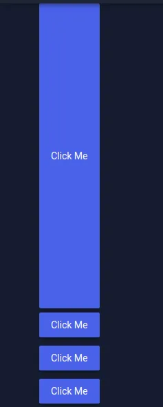
Flexible
You can achieve similar functionality as in the Expanded widget using the Flexible widget. In this case, you’ll have to specify FlexFit as shown below:
FlexFit.tight
FlexFit.loose

Padding
As you can see above, the buttons would look much better if they had some padding around them. You can add some padding by wrapping them with a container and setting the padding or simply wrapping them with a Padding widget.
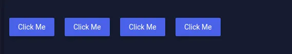
RaisedButton
From the previous screenshot, you can see that this widget is used to create a button.
State Management
In Flutter you’ll need to manage the state of a widget as well as the state of the entire application. Widget states can be managed using the Stateful widget. Where state management isn’t needed, a Stateless widget is used instead.
In the beginning, you might have noticed the use of ChangeNotifierProvider. This is a functionality offered by the Provider package and is used to manage the application-wide state…mostly. This is especially useful when managing data. When the data changes, all the widgets that were listening to this provider will be updated. Since state management with the Provider package can be a full article by itself, we’ll leave it there for now.
Plugins and Packages
Pub.dev provides a rich pool of packages to aide in your Flutter development.
Some of my favorites are:
- The intl package for dealing with internationalization, date, and number formatting.
- The dio package that you can use when working with APIs, especially when sending FormData.
- Shared Preferences that allow you to persist data in device storage. Such data could be, for example, the API access token.
- Provider, obviously for state management.
- Flutter Launcher Icons that you can use to generate icons when you’re ready to publish your app. It’s a great tool because it generates IOS and Android icons in their different sizes.
Conclusion
Hopefully, this gives some helpful background into the Flutter ecosystem. If you’d like to dive in a little deeper, head over to Flutter.dev. If you’re looking to acquire a new skill in 2020, then you’ll find Flutter and Dart very easy to pick up. If you do, I can’t wait to see what you build!
For now, stay tuned — more Flutter tutorials on the way soon.
This article looks like text from a year or two or three years ago. In particular, Skia has been substantially replaced with Impeller, and Provider with Riverpod.