
The objective of data science projects is to make sense of data to people who are only interested in the insights of that data. There are multiple steps a Data Scientist/Machine Learning Engineer follows to provide these desired results. Data pre-processing (Cleaning, Formatting, Scaling, and Normalization) and data visualization through different plots are two very important steps that help in building machine learning models more accurately.
Introduction
The idea of this post is to explain these terms and their roles in machine learning modeling, and to discuss their impacts on various business applications.
We’ll be using the Chocolate Bar Dataset (sounds yummy, right?). This dataset includes chocolate ratings, origins, percentage of cocoa, and the variety of beans used and where the beans were grown.
The dataset has so much information—I bet most of you must be thinking, what should we do with this data and what kind of information can be obtained? There is a lot we can do with the data, but for this particular exercise, we’ll explore the data to answer the following questions, using different visualization tools like distribution plot, box plot, KDE, and violin plot:
- What is the average rating for blended and pure chocolates?
- Which countries produce the highest rated chocolates bars?
- Find the distribution of cocoa percentage throughout the dataset (different data points).
Before finding the answers to above questions, we need to perform some data preprocessing steps — cleaning, formatting, etc., in order to visualize the data more clearly.
Data Preparation: Cleaning & Formatting Data
The data pipeline starts with collecting the data and ends with communicating the results. The process is not as easy as it sounds. There are multiple steps involved — one of the most important step is data pre-processing.
Data pre-processing itself has multiple steps and the number of steps depends on the type of data file, nature of the data, different value types, and more.
Meet Data Pre-processing
Wikipedia Definition,
What is it, then, that makes data pre-processing so important in machine learning or in any data science project?
Importance of Data Pre-processing
Let’s take a simple example: A couple goes into a hospital for a pregnancy test — both the man and woman have to go through the test. Once the pregnancy results return, they suggest that the man is pregnant. Pretty weird, right?
Now try and relate this to a machine learning problem — classification. We have 1000+ couples’ pregnancy test data, and for 60% of the data, we know who’s pregnant. For the remaining 40% we need to predict the results on the basis of previously recorded tests. Let’s say, out of these 60%, 1% suggests that the man is pregnant.
While building a machine learning model, if we haven’t done any pre-processing like correcting outliers, handling missing values, normalization and scaling of data, or feature engineering, we might end up considering those 1% of results that are false.
The machine learning model is nothing but a piece of code; an engineer or data scientist makes it smart through training with data. So if you give garbage to the model, you will get garbage in return, i.e. the trained model will provide false or wrong predictions for the people (40%) whose results are unknown.
This is just one example of incorrect data. People might end up collecting inappropriate values (e.g. negative salary of an employee), sometimes missing values. This can all result to misleading predictions/answers for the unknowns.
This is just one example of incorrect data. People might end up collecting inappropriate values (e.g. negative salary of an employee), sometimes missing values. This can lead to misleading results for the unknowns.
Getting Started with Data Pre-processing
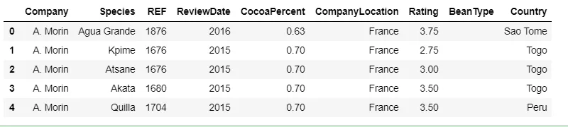
Let’s load our chocolate data and explore if it needs any data pre-processing.
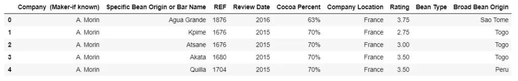
It seems like we can ignore one missing value in the Bean Type column. So no imputation (inserting values) is required.
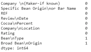
Let’s pause here and look at the column name in the above image. Specifically, we’re looking at the structure of the dataset :
The column name contains n — this will give the errors during data analysis. Let’s format the column names:
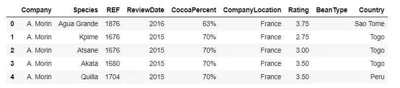
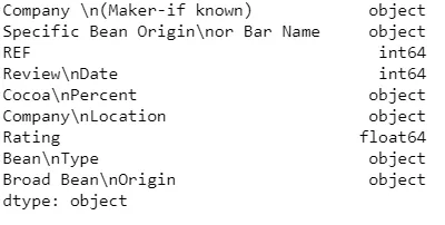
The column CocoaPercent contains % sign — this will also give further errors. So we need to format this, too.
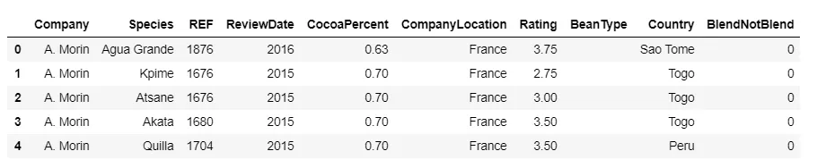
Let’s create a new column, BlendNotBlend. This column will provide information on whether the chocolate is made with a mixture of flavors or is pure. We’ll talk about the reason behind creating this column in the next section.
We’ve cleaned and formatted the data. Now we want to see the presentation of this data using some visualization tools and answer the questions we discussed in the introduction.
Data Visualization
Data visualization is an integral part of any data science project. Understanding insights using excel spreadsheets or files becomes more difficult when the size of the dataset increases. It’s certainly not fun to scroll up/down to do an analysis. Let’s understand visualization and its importance in machine learning modeling. We’ll also try to explore the chocolate bar dataset using a few of these tools.
Visualize the data
In data visualization, we use different graphs and plots to visualize complex data to ease the discovery of data patterns. How does this visualization help in machine learning modeling, or even before we start modeling?
Importance of Visualization
The CSV data (panda dataframes) can be really difficult to approach if you want to get some insights. It doesn’t matter if your data is formatted or not formatted correctly. According to SaS Data Visualization’s webpage,
Data visualization also helps identify areas that need attention, e.g outliers, which can later impact our machine learning model. It also helps us understand the factors that have more impacts on your results: for example, in house price predictions, the house price will be impacted more by the size of the house than the house style.
Visualization doesn’t just help before the modeling but even after it, too. For instance, it could help in identifying different clusters in a dataset, which is obviously very difficult to see through just simple files, without having proper visualization.
Visualization impacts modeling in many ways, but it’s especially handy in the EDA (Exploratory Data Analysis) phase, where you try to understand patterns in the data. For this particular exercise, we’ll visualize the distribution of chocolate bar data using some popular techniques.
Visualization Tools
The chocolate bar dataset has different kinds of values — Categorical and Continuous/Numeric. We’ll only be focusing on visualizing the distribution of continuous variables. Let’s jump into plotting.
1. Histogram Plot
The main question here is which data should we pick up and check the distribution? After reading the above definition one might say, “Oh! Except object or categorical variables/values, we can plot a histogram for anything.” This is a valid point, but are we certain that all continuous values tell a meaningful story?
Let’s start with the Rating column.
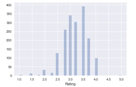
The number of different ratings given are counted and plotted. The bars are displayed next to each other, because the variable being measured is continuous and is on the x-axis. What’s the story behind this plot? We can see around 390 people provide 3.5 rating for the chocolates.
Now, the REF column,
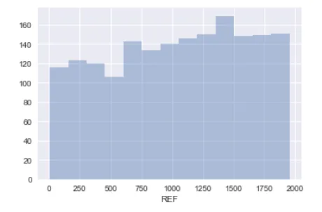
The REF column is the reference number of the ratings received. The higher reference number is the latest one.
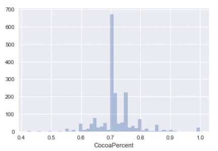
The next continuous variable is CocoaPercent. A lot of people like dark chocolates (I don’t), so we want to see the distribution of the darkness included in the chocolates.
2. Box Plot
Box plots give an impression of the underlying distribution. But that’s what Histograms do, too. Then why do we need box plots? In histograms, when you compare many distributions, they do not overlay well and take up a lot of space to show them side-by-side.
Here we’re going to create a box plot for chocolate manufacturing facilities and the ratings given by customers.
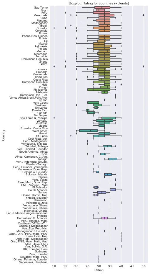
In the above plot, you can clearly see the ratings given to chocolate bars for each individual country. This visualization can help us understand the distribution of ratings throughout the dataset according to each countries and further help in finding which country has more popularity than others.
It also explains which country is more profitable to the sellers and potential regions to target. We can further calculate the average rating and sort the data before box plotting. But for this post, we aren’t going into too many details here.
3. Violin plot
Recently I came across Violin plots and yes, they does resemble the instrument. So see what it can tell us about the data.
Pretty complicated, right? In order to simplify this, let’s try and plot in steps.
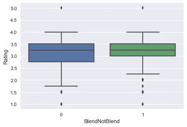
Remember how earlier we created a column BlendNotBlend. Well here, we’re going to use it. We’re going to see how a Blended or Pure chocolate did by comparing the ratings received.
- Box plot (small one unlike the above box plot): The below plot shows that blended chocolate did better than pure chocolate. So it seems from the data that more people like chocolate with different flavors or a mixture of different flavors.
2. KDE (kernel density plot)- Let’s try and plot the same thing using a KDE plot.
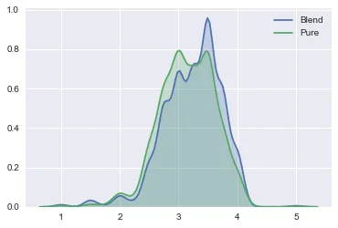
So the above plot covers the area of observations/column values and gets bigger with more data points. The rationale behind this is that each value can be thought of as being representative of a greater number of observations. We can sum all of the kernels to give a smoothed distribution.
3. Violin Plot- We will now put together the box plot and KDE plot.
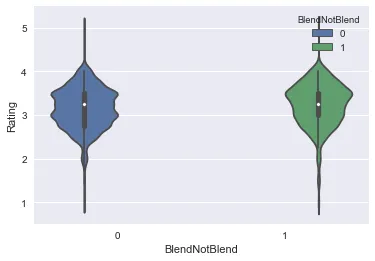
The violin plot shows a clear smooth curve i.e. the combination of box and KDE plot. With the above plot you can easily identify how “Blend” bar has a larger area covered for ratings, i.e. it got more reviews than pure bars and it also has received different types of ratings. The benefit of using this plot is there’s no need to read a lot of plot points to make sense of the data.
Summary
Throughout this post, we’ve explored how data preprocessing and data visualization can impact the complex machine learning model building phase. We learned about different data pre-processing techniques and tried out a few on the chocolate bar dataset.
In respect to this data, imagine we want to learn more about the distribution of current and future ratings/reviews so that companies can improve their production and strategy of making bars. If we don’t handle missing values or correct the incorrect/corrupted data, this will result in inaccurate decision making during modeling phase.
We also explored a few data visualization tools and discussed how visualization can impact modeling itself. Each visualization tool has its own significance in story telling, and it’s important to understand which ones can be used with particular types of data.
References
- Violin plot
- Kaggle Dataset
- Motivation — Blazing fast EDA
- GitHub repo
- SaS Visualization
- Data Pre-processing
Discuss this post on Hacker News.

Comments 0 Responses