
In this tutorial, we’ll learn the basics of creating an intro slider using React Native. To do this, we’ll use a React Native module known as react-native-app-walkthrough, and the result will be a simple and configurable app introduction slider.
The detailed explanation of each step for this tutorial is provided below:
Installing react-native-app-intro-slider package
First, we need to simply install the react-native-app-walkthrough package. We can do this using NPM (Node Package Manager) or yarn, and for this, we’ll using NPM. Open your NPM console or command prompt within your project directory and enter the following code snippet:
npm install react-native-app-walkthrough --saveImporting the package to App.js
This next step is pretty easy—we just need to import the react-native-app-intro-slider package into our project’s App.js file. All the modules and methods inside of react-native-app-walkthrough can now be accessed via the IntroSlider variable in out App.js file. You can perform this by writing the following piece of code in your React Native App.js file:
import IntroSlider from 'react-native-app-walkthrough';Creating a state to handle walkthrough visible status
We also need to create a state to handle walkthrough visible status—in other words, to check whether the intro slider is visible or not in our app interface. Thus, we create the state variable defined as show_App to store the Boolean value for our state handler, which is initialized inside our constructor() method. You can perform this using the following piece of code:
constructor(props) {
    super(props);
    this.state = {
        show_App: false
      };
  }
Creating two simple functions to handle slide visible state
Creating a state isn’t enough—we need to handle its values as well. To do this, we need to create two simple functions. These handler functions are shown in the code snippet below:
doneAll = () => {
    this.setState({ show_App: true });
  };
onSkip = () => {
    this.setState({ show_App: true });
  };
The above two functions doneALL() and onSkip() will enable the program to handle the state show_App and set it as true wherever the functions are called in our project.
Setting up a simple condition to show walkthrough/the main app
In this step, we make use of our simple show_App state condition to make either the main app or walkthrough visible in our app interface.
For this, we need to define a render() function that will return a template <View> to the app interface if the condition of our state show_App is true; otherwise, it will return the AppIntroSlider module to our app interface to view the walkthrough.
You can see in the following code that our two handler functions are used in AppIntroSlider tags to handle the state variable. You can make use of the following code snippet for this operation:
render() {
    if (this.state.show_App) {
      return (
        <View style={styles.mainapp}>

          <Text style={{ textAlign: 'center', fontSize: 20, color: '#f7df1e' }}>

            This is your main App .

          </Text>

        </View>
      );
    } else {
      return (
        <IntroSlider
          slides={slides}
          onDone={this.onDone}
          showSkipButton={true}
          onSkip={this.onSkip}
        />
      );
    }
  }
}
Adding Mock data for feed AppIntoSlider package
In this step, we’ll add mock data to our AppIntroSlider package. Here, we’re using the following dataset with the slides list, which contains key, title, text, image, etc. You can use your own dataset, but keep in mind that every key should be a unique value. The example of the slides dataset is provided below:
const slides = [
{
key: 's1',
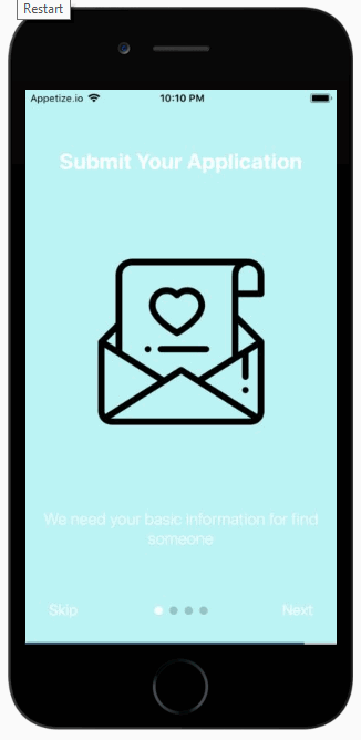
title: 'Submit Your Application',
text: 'We need your basic information for find someone ',
image: {
uri:
'https://imgur.com/7ClQj9M.png',
},
titleStyle: styles.title,
textStyle: styles.text,
imageStyle: styles.image,
backgroundColor: '#BCF4F5',
},
{
key: 's2',
title: ' Found match',
text: 'Good new we Found someone who matching you',
image: {
uri:
'https://imgur.com/BVQ79rh.png',
},
titleStyle: styles.title,
textStyle: styles.text,
imageStyle: styles.image,
backgroundColor: '#B4EBCA',
},
{
key: 's3',
title: 'Just Dating ',
text: 'let hangout and enjoy together with special place and special deal',
image: {
uri: 'https://imgur.com/RPI8wie.png',
},
titleStyle: styles.title,
textStyle: styles.text,
imageStyle: styles.image,
backgroundColor: '#D9F2B4',
},
{
key: 's4',
title: 'Got new Love',
text: ' Your not lonly anymore',
image: {
uri: 'https://imgur.com/f1GhQo1.png',
},
titleStyle: styles.title,
textStyle: styles.text,
imageStyle: styles.image,
backgroundColor: '#FFB7C3',
}
];The meaning of each keyword in the above code snippet is explained below:
- key: The key should be unique for each slide.
- title: Represents the title of the slide.
- text: Represents the description text of the slide.
- image: You need to pass the image path in the slide here.
- titleStyle: You’ll use this to call the title style.
- textStyle: You’ll use this to call the description text style.
- imageStyle: You’ll use this to call the image style.
- backgroundColor: Using this, you’ll define background color in HEX color code format.
Adding some basic CSS styles with stylesheet
Finally, in this step, we need to add some styles to our main app using the following CSS stylesheet:
const styles = StyleSheet.create({

  mainapp: {
    flex: 1,
    alignItems: 'center',
    justifyContent: 'center',
    padding: 20
  },
  title: {
    fontSize: 26,
    color: '#fff',
    fontWeight: 'bold',
    textAlign: 'center',
    marginTop: 20,
  },
  text: {
    color: '#fff',
    fontSize: 20,
  },
  image: {
    width: 200,
    height: 200,
    resizeMode: 'contain'
  }
});
Recap
There are actually multiple ways to build this app introduction slider in React Native, but this tutorial makes use of the react-native-app-walkthrough package, which is comparatively easier to use than some other methods.
Following these seven steps will help you configure your own introductory slider experience in a React Native app. You can also find and study lots of other configurations using this package. Finally, by following the steps mentioned in this tutorial, you’ll be able to create a simple intro slider and guide new users through your new React Native application. The overall coding structure of the app can be seen in the screenshot below:
import React, { Component } from 'react';

import { StyleSheet, View, Text, Platform } from 'react-native';

import AppIntroSlider from 'react-native-app-intro-slider';

export default class App extends Component {

  constructor(props) {
    super(props);
    this.state = {

      show_App: false

    };
  }

  onDone = () => {
    this.setState({ show_App: true });
  };

  onSkip = () => {
    this.setState({ show_App: true });
  };
  render() {
    if (this.state.show_App) {
      return (
        <View style={styles.mainapp}>

          <Text style={{ textAlign: 'center', fontSize: 20, color: '#fff' }}>

            This is your main App .

          </Text>

        </View>
      );
    } else {
      return (
        <AppIntroSlider
          slides={slides}
          onDone={this.onDone}
          showSkipButton={true}
          onSkip={this.onSkip}
        />
      );
    }
  }
}
const styles = StyleSheet.create({

  mainapp: {
    flex: 1,
    alignItems: 'center',
    justifyContent: 'center',
    padding: 20
  },
  title: {
    fontSize: 26,
    color: '#fff',
    fontWeight: 'bold',
    textAlign: 'center',
    marginTop: 20,
  },
  text: {
    color: '#fff',
    fontSize: 20,
  },
  image: {
    width: 200,
    height: 200,
    resizeMode: 'contain'
  }
});

const slides = [
  {
    key: 's1',
    title: 'Submit Your Application',
    text: 'We need your basic information for find someone ',
    image: {
      uri:
        'https://imgur.com/7ClQj9M.png',
    },
    titleStyle: styles.title,
    textStyle: styles.text,
    imageStyle: styles.image,
    backgroundColor: '#BCF4F5',
  },
  {
    key: 's2',
    title: ' Found match',
    text: 'Good new we Found someone who matching you',
    image: {
      uri:
        'https://imgur.com/BVQ79rh.png',
    },
    titleStyle: styles.title,
    textStyle: styles.text,
    imageStyle: styles.image,
    backgroundColor: '#B4EBCA',
  },
  {
    key: 's3',
    title: 'Just Dating ',
    text: 'let hangout and enjoy together with special place and special deal',
    image: {
      uri: 'https://imgur.com/RPI8wie.png',
    },
    titleStyle: styles.title,
    textStyle: styles.text,
    imageStyle: styles.image,
    backgroundColor: '#D9F2B4',
  },
  {
    key: 's4',
    title: 'Got new Love',
    text: ' Your not lonly anymore',
    image: {
      uri: 'https://imgur.com/f1GhQo1.png',
    },
    titleStyle: styles.title,
    textStyle: styles.text,
    imageStyle: styles.image,
    backgroundColor: '#FFB7C3',
  }
];
Comments 0 Responses